Pages are built from blocks. The same blocks power website pages, landing pages, blog posts and funnel pages, and every block reads your Style Guide, so it stays on-brand automatically. This is the full list, and how to add one.
Who can do this
- Staff, admins and owners can add and edit blocks and save drafts.
- Viewers can open the builder, but their changes can't be saved.
Add a block
- Open a page in the builder. In the Sections outline, click Add block under the section you want.
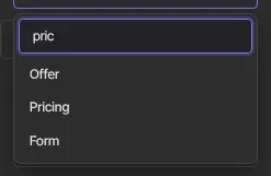
- Type in Search blocks… to filter the list, for example "price", or scroll through it.
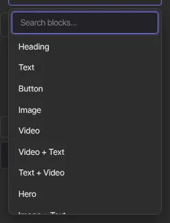
- Click a block. It's added at the bottom of that section and selected, so its settings open on the right.
- Fill in its settings, then Save draft.
Text and lists
- Heading and Text: the basics, with alignment. A heading can have an Eyebrow (a small uppercase label above it, such as "Our services") and a Subtext line under it. Text supports bold, italic and links, and has an optional Drop cap (large first letter). Set a paragraph's Size to Lead (larger opening paragraph) to set the first lines of a post a size up.
- Text in panel: a heading and text inside a bordered card.
- Checklist: a list of items, each with a checkmark. Add an optional Title above it. Turn on Use crosses (✗) instead of ticks for pain points or a "not for you if…" list, where a tick would read as approval. Position moves the whole list left, centre or right; each line stays lined up beside its mark. Columns splits a long list in two (one column on phones).
- FAQ: questions and answers.
- Link list: labelled links, stacked or inline. Set Style to Buttons to draw each link as a full-width button that is easy to tap on a phone, as on a link-in-bio page; Align places the list left, centre or right.
Media
- Image: upload one, pick it from your Media Library, or paste a link. Add alt text and an optional link.
- Image shape: Image, Image + Text, Text + Image, a side-by-side Hero, Feature cards and Image gallery can crop photos to one shape: square, portrait (4:5 or 2:3), landscape (4:3, 3:2 or 16:10), widescreen (16:9) or panorama (21:9). An empty image slot in the builder shows the shape, so you know what to upload. Original shape shows the photo uncropped; a gallery is square unless you pick another shape.
- Image focus: where one photo is cropped (Image, Image + Text, Text + Image and Hero), this keeps the part that matters in view. Type "top", "center bottom", or a position across and then down, such as "70% center". A hero's focus also moves its background photo.
- Video: a YouTube, Vimeo or Loom video. Add a Thumbnail image and visitors see it behind a play button; the video loads only when they press play. Audio: an audio player from a file link (mp3 and similar).
- Round profile photo: set an Image block's Frame to Round (profile photo) for a circular photo at the top of a page, such as a link-in-bio page. Pick Small (96px) or Medium (132px). The photo is cropped to a square, so its Image focus still keeps a face in view.
- Image gallery, Video gallery and Carousel: collections and swipeable strips. Each photo in an Image gallery or Carousel can have an optional Caption, shown in small text under it.
- Logo, Logo list and Logo carousel: your site logo, or a row or rotating strip of partner logos.
Text with media
- Image + Text and Text + Image: an image beside a heading and paragraph, either side, with an optional Eyebrow (a small label above the heading) and an optional button, which takes the same Button style (solid, outline or soft), shading and rollover as a hero's.
- Video + Text, Text + Video and Text & audio: the same for video and audio.
Layout and structure
- Columns: two to four columns of text.
- Spacer and Divider: breathing room and a horizontal rule.
- Hero and Banner: a big headline band with a call to action, and a slim announcement strip. A hero can also have an Image on dark themes and an Image on warm themes, each with its own darkening. Your page shows the one that suits its colours: dark when the page background is dark; warm when the background is cream or earthy, or the primary colour is red, orange or pink. Otherwise it shows the main Image. A slim banner's Link style shows its link as a Text link or a Button; a large banner always shows a button. Turn on a banner's Full width, edge to edge and give it a section of its own: the section then runs the full width of the screen with no padding, like an announcement strip across the top of the page.
- One main headline per page: search engines read a page's main headline (its H1) to learn what the page is about. The first Hero on a page is its main headline. Any later hero looks exactly the same but counts as a section heading. If your page has no hero, set its first Heading to H1 under Level.
- Feature cards and Stats: a grid of up to 12 cards, and two to four big numbers.
Buttons and conversion
- Button and Button group: one call-to-action button, or a row of up to five.
- Call to action: a headline, supporting line and button.
- Countdown: a live countdown to the Target date & time you set, then the text you choose.
- Form: lead capture only. It creates a contact from your chosen form. Its Layout can be Single column, One row (field and button side by side) for a short sign-up such as a newsletter (the fields wrap onto their own lines on a phone), or a split layout with text beside the form. See Forms and opt-ins.
Commerce
- Offer: a price card for one offer, linking to its checkout. Its How it’s bought setting can be One click (thank-you pages): on the page your checkout sends buyers to after they pay (the offer's after-purchase page, on your site), the card shows Yes, add it to my order and No thanks (rename both in Button and Decline link). Yes charges the card the buyer just used, with no checkout, and the page then says "✓ Added to your order." The buyer gets a receipt for the add-on, and their first receipt's link still works. It works for a published, one-time, paid offer; if the card can't be charged that way (the bank wants the buyer to confirm, say), the buyer goes to that offer's checkout instead. Opened any other way, without a purchase just made, the card links to checkout as usual.
- Pricing: several offers as side-by-side pricing cards. Each plan can have a Badge on top of its card (such as "Most popular") and a Billing note that replaces the line under the price (such as "per person").
- Course outline: the published modules and lessons of a course.
- Scheduling: an embedded booking page from a service such as Calendly or SavvyCal.
These read your live offers and products, so prices shown are always current.
Site pieces and social proof
- Menu: any of your navigation menus (the header menu unless you pick another).
- User menu: a log-in or account link.
- Social icons: links to your social profiles.
- Testimonials: one to three quote cards.
- Instructor: the instructor bio you set in Site Details.
- Recent posts: your latest published blog posts, each with its date and first tag. Choose a Grid (2 or 3 columns) or a List with one post per row and a small picture on the right. Show the newest post large puts your latest post across the top. Show topic filters adds a row of your post tags; each opens your blog showing only posts with that tag. Show excerpts turns the short summaries on or off, and Button under the posts (for example "Older posts") links to your whole blog.
Advanced
- Custom code: your own HTML, such as an external widget. It runs only on your live site. In the builder and in previews it shows with scripts removed.
Blocks in emails
Email templates and broadcasts use the same builder with a smaller set of blocks: Heading, Text, Image, Button, Link list, Countdown, Divider and Spacer. See Email templates and sender settings.
What happens next
- Blocks you add are part of the draft. They reach visitors when an owner or admin publishes the page.
- Commerce and form blocks show your current offers and forms every time the page loads.
Common errors
- An Offer or Pricing block shows no price: pick a published offer in its settings.
- A Form block collects nothing: pick a form in its Form setting. Without one there's nothing to submit to.
- "No blocks match “…”.": try a different word, or clear the search box.
- Custom code doesn't run in the builder: that's expected. Check it on your live site.