The Style Guide holds your site's look: brand colours, fonts, text sizes, corner rounding and button style. Every page, landing page and blog post reads from it, so changing one colour here restyles the whole site at once, with no page-by-page repainting. You can start from one of our five palettes, and save the current look as a named template and switch between templates.
Who can do this
- Owners and admins can apply a palette and save the Style Guide and the Blog Style Guide.
- Staff can't apply a palette or save the Style Guide form: they see "You don’t have permission for this." They can save, apply and delete Style Guide templates, and applying a template changes your live site.
- Viewers can look only. Saving shows "You don’t have permission for this.", and Apply or Delete shows "You don’t have permission to do that."
Start from a palette
Our eight palettes match the photos and layouts of our website templates: Paper (light and minimal), Night (dark-first), Clay (warm and earthy), Harbor (cool and corporate), Bloom (soft and pastel), Graphite (dark and warm), Studio (bright product showcase) and Market (retail and practical, with yellow buttons).
- Go to Website → Style Guide (
/website/style-guide). The first panel is Palettes. It starts by saying which palette your site uses ("Your site uses the Bloom palette."), or that it uses its own colours. Each card shows the palette in its own colours and fonts, and the card of the palette in use is outlined. - Click Apply on a palette. Click Apply plus the palette's name (for example Apply Night) to confirm, or Cancel.
- "Night applied" (or the palette you chose) appears. The Style Guide below shows the new colours and fonts, and the palette's card says In use, with Apply again in place of Apply. Your live site changes at once.
A palette changes what your visitors and customers see: your website, landing pages, blog, forms and checkout. It doesn't change how Zinstruct itself looks for you and your team. Course lessons keep the player look set on each product.
A palette replaces:
- the page colours: Primary, Primary text, Page background, Surface, Body text, Headings, Muted text and Borders. Secondary accent becomes the same as Primary;
- the band colours: Dark band, Dark band text, Accent band and Accent band text;
- the Button colour and Button text colour: Market sets its own; the others clear them, so solid buttons use Primary;
- the Heading font, Body font and heading weight;
- the Corner radius (px).
Your header and footer colours are cleared, so the header and footer follow the palette. Your text sizes, line heights, Content width (px), buttons and Error / validation colour stay as they are. So do the Blog Style Guide's own settings and any page's Design changes.
Hero photos that have a dark or warm version switch with the palette. For example, Business — minimal's skyline is at night with Night and at dawn with Clay or Bloom.
To keep your current look, save it under Saved templates before you apply a palette. You can then fine-tune the palette in the Style Guide and click Save style guide.
Change colours, fonts and buttons
- Go to Website → Style Guide (
/website/style-guide). Below Palettes is the Style Guide panel. - Click a swatch to set each colour: Primary, Primary text, Page background, Surface, Body text, Headings, Muted text, Secondary accent, Error / validation and Borders. Dark band and Accent band (each with its … text colour) are the backgrounds a section gets when you set its Background to Dark or Accent in the builder. Several of our templates open with a Dark band.
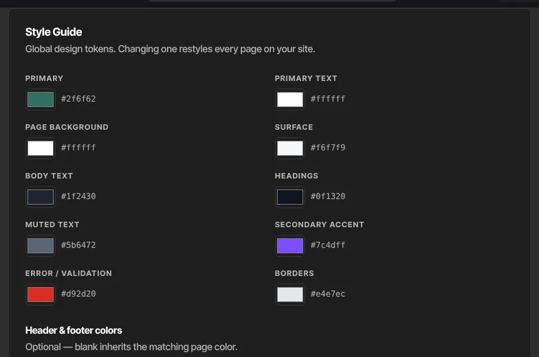
- Under Header, footer & button colors, type colours such as #101015 for Header background, Header text, Footer background and Footer text. Leave a box blank to use the matching page colour. Button colour and Button text colour paint solid buttons, for example a bright button on a dark brand colour. Leave them blank and solid buttons use Primary. Links, outline buttons and Primary bands always use Primary.
- Set the Content width (px) (480 to 1600) and Corner radius (px) (0 to 40).
- Under Typography, pick a Heading font and Body font, or leave Theme default (Inter Tight). Set the weights and line heights.
- Under Type scale (px), set sizes for H1, H2, H3 and Body, for Desktop and Mobile (screens 640px wide or less).
- Under Buttons, choose a Style (Solid or Outline), a Size (Small, Medium or Large), a Button radius (px) (leave it blank to inherit) and whether to use Full-width buttons.

- Click Save style guide. A green Saved badge appears.
Save, apply or delete a Style Guide template
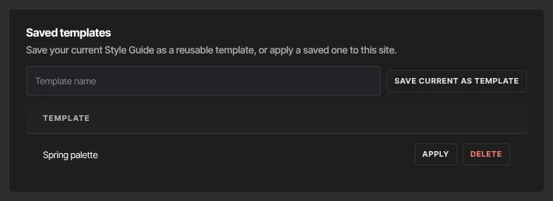
- In the Saved templates panel, type a Template name and click Save current as template. "Saved" appears. It saves the Style Guide as it was last saved, so save your changes first. It doesn't save page layouts or the Blog Style Guide.
- In the table, click Apply on a template to replace your Style Guide with it. Your live site changes at once.
- Click Delete to remove a template. It's deleted straight away, without asking.
Change the look of one page only
To give a single page different colours or a different font, use Design in the builder. See Edit a page in the builder.
The blog's own look
The Blog Style Guide panel below the Style Guide lets your blog read differently from the rest of your site. See Blog settings: SEO, look, RSS feed and comments.
Logo, favicon and site title
These are in Site Details, not here.
What happens next
- Applying a palette, saving or applying a template changes every live page, landing page and blog post that uses those settings, straight away. There's no publish step.
- Pages with their own Design overrides keep them.
- The builder shows the new look the next time you open a page.
- Your admin app's light or dark theme is separate and doesn't change your site.
Common errors
- "Please fix the highlighted fields.": a header or footer colour isn't a colour code like #1a1a1a, or a number is outside its range.
- "Could not save the style guide.": try again.
- "No theme found.": reload the page and try again.
- "Could not apply the palette. Check the Style Guide for an invalid value, save it, then try again.": one of your saved settings is out of range. Fix it in the Style Guide, click Save style guide, then apply the palette again.
- "Could not apply the palette." or "Pick a palette.": reload the page and try again.
- "You don’t have permission for this.": only owners and admins can apply a palette or save the Style Guide, and viewers can't save templates.
- "Name the template.": type a name before clicking Save current as template.
- "Could not save the template.": try again.
- "You don’t have permission to do that.": viewers can't apply or delete templates.